Acura Canada
Website
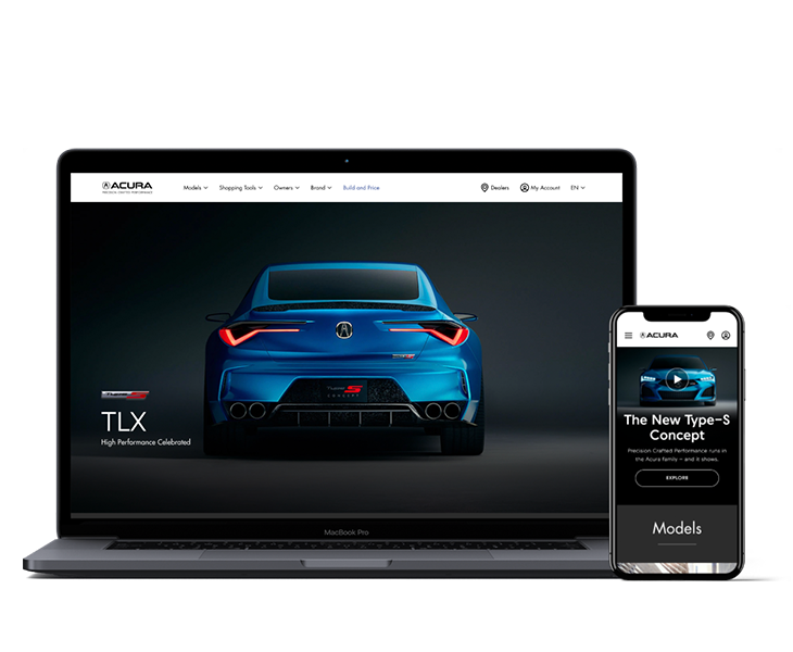
One step forward towards buying an Acura online.
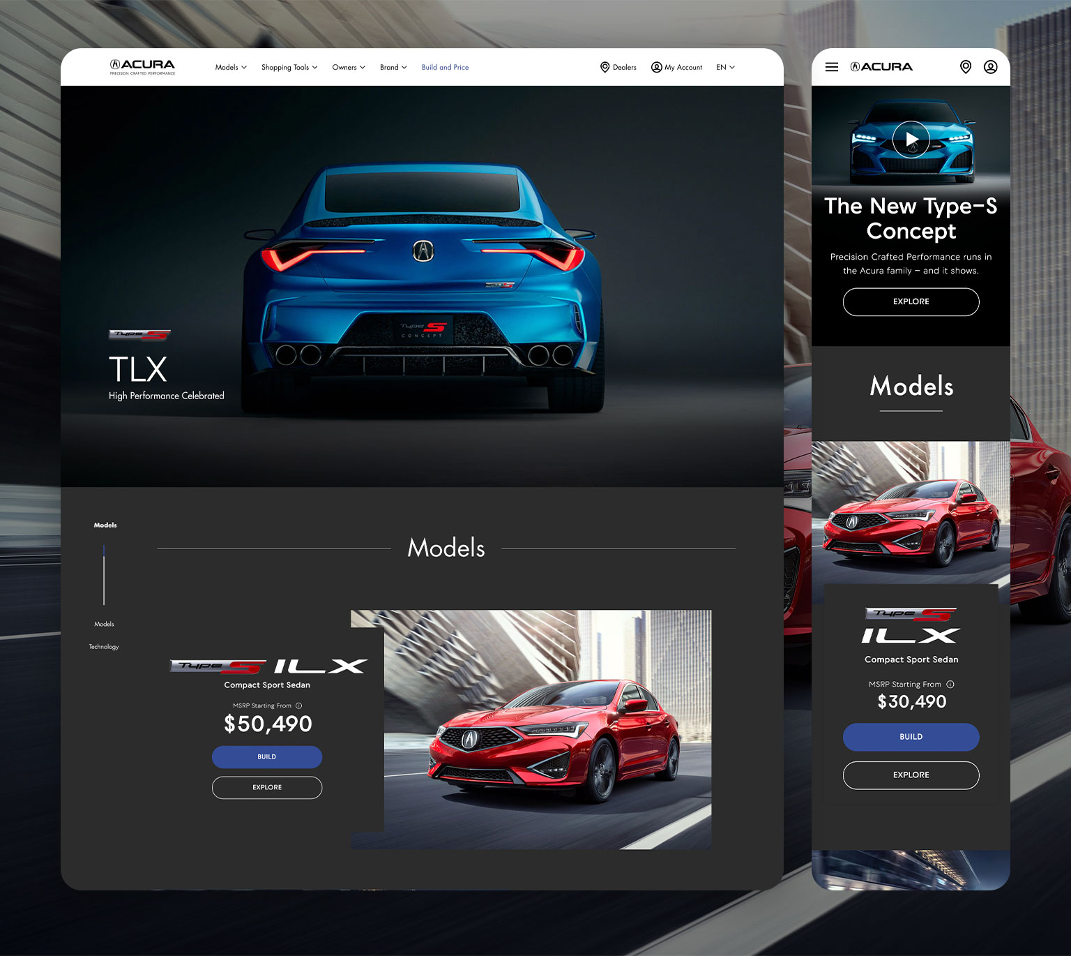
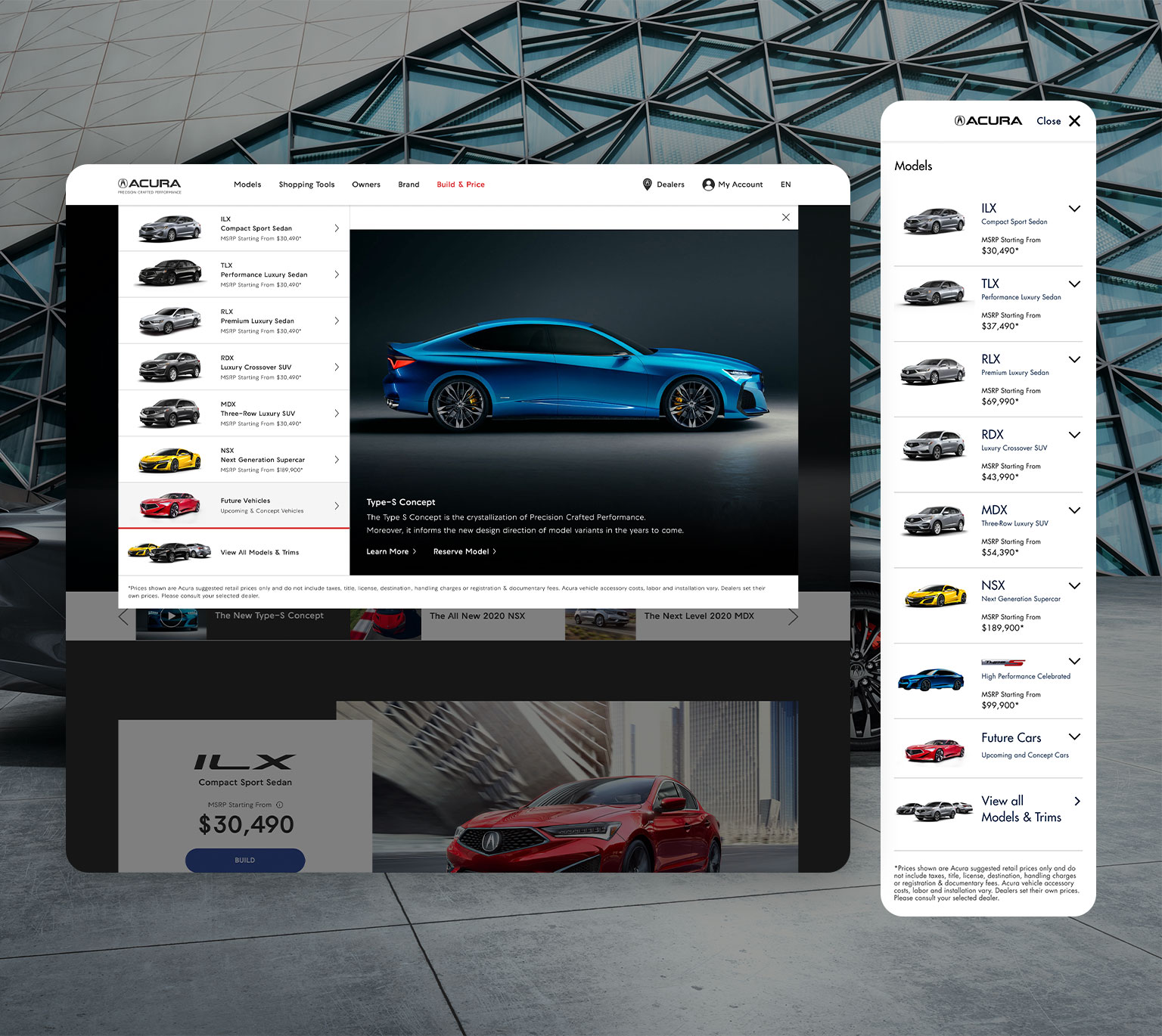
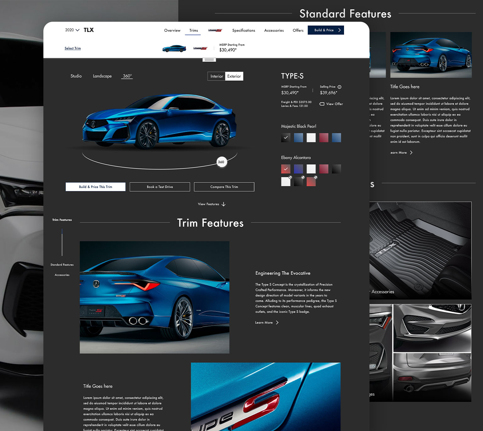
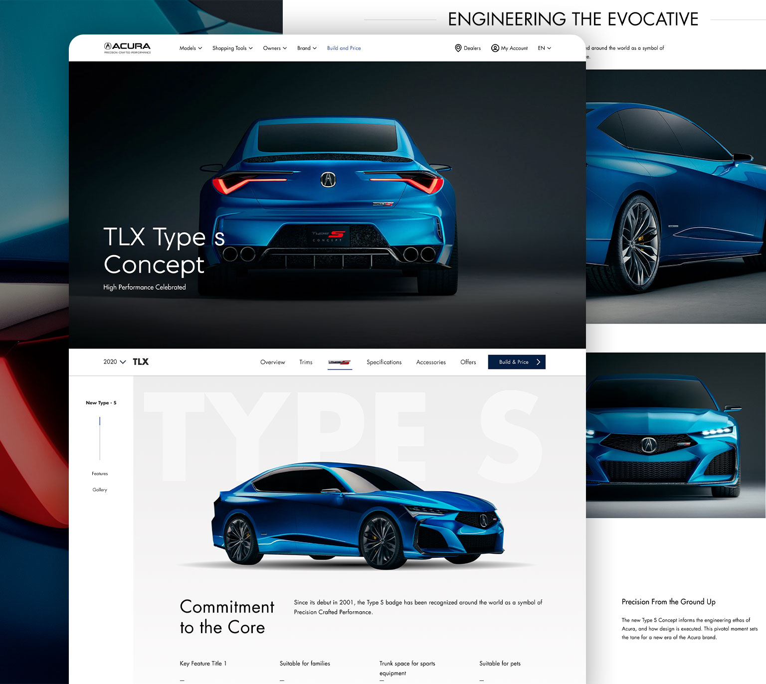
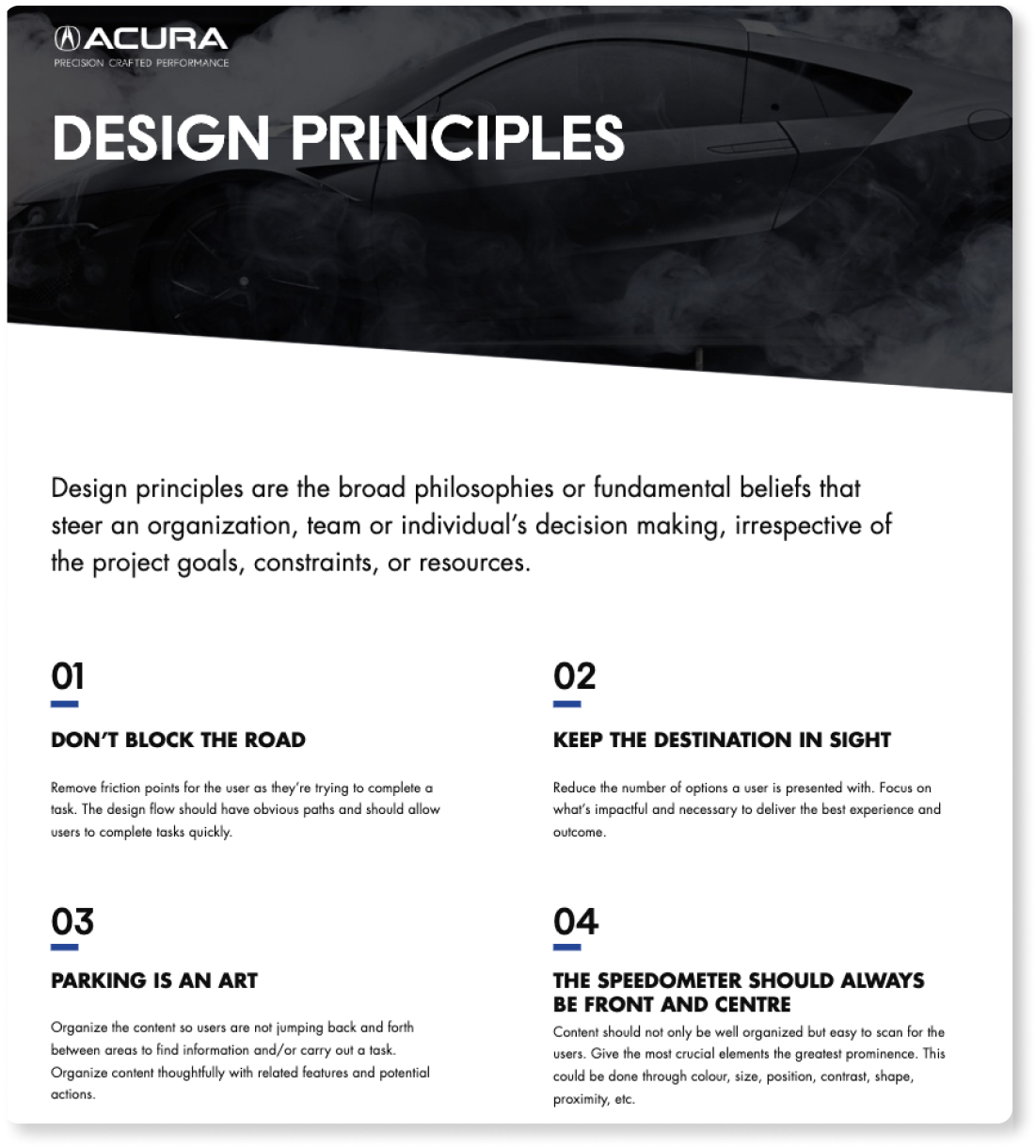
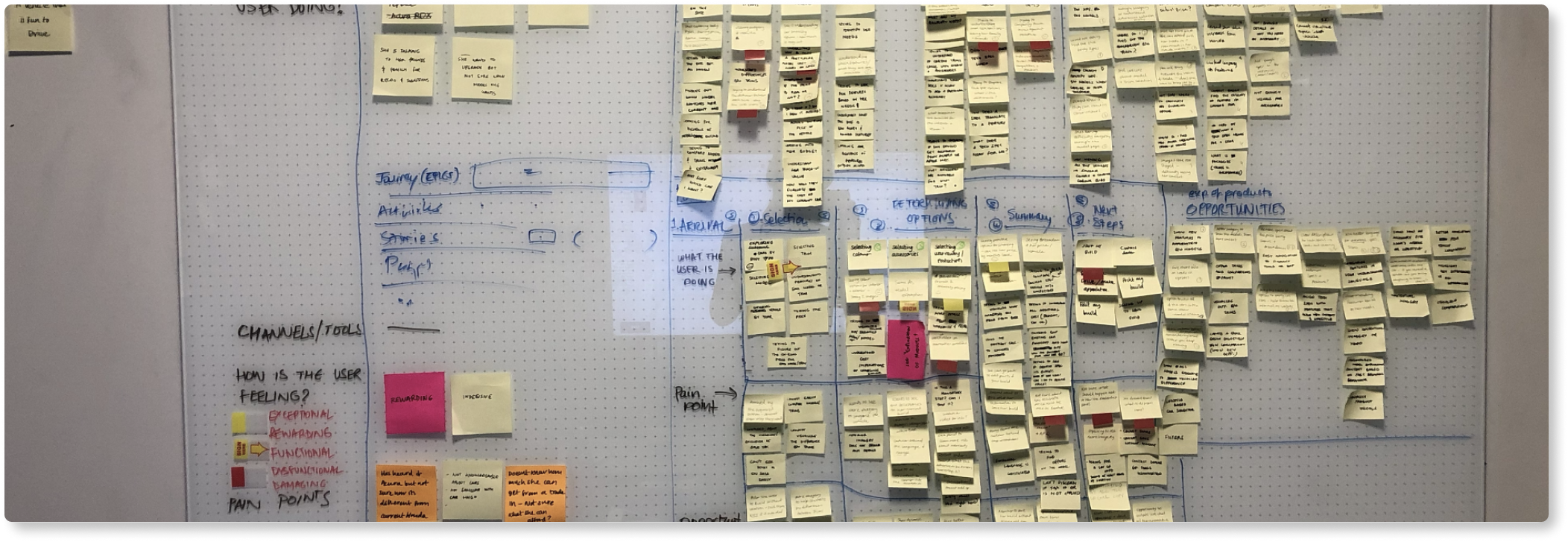
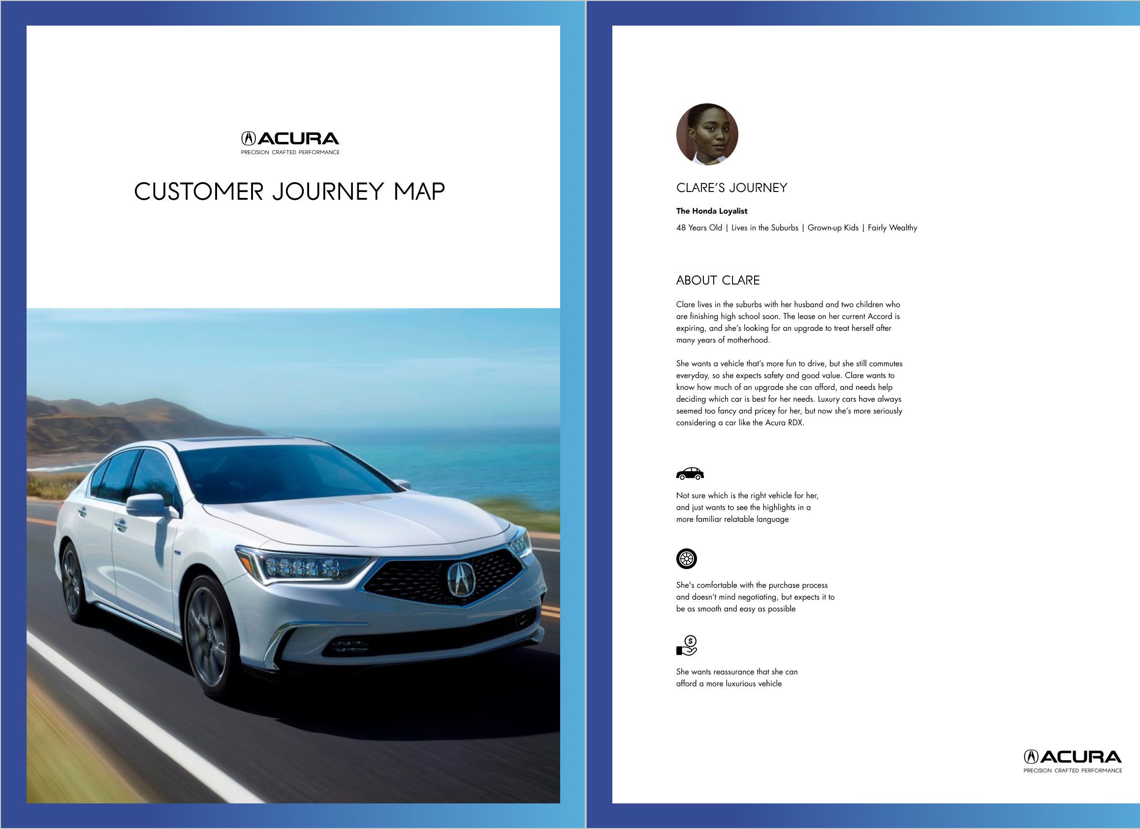
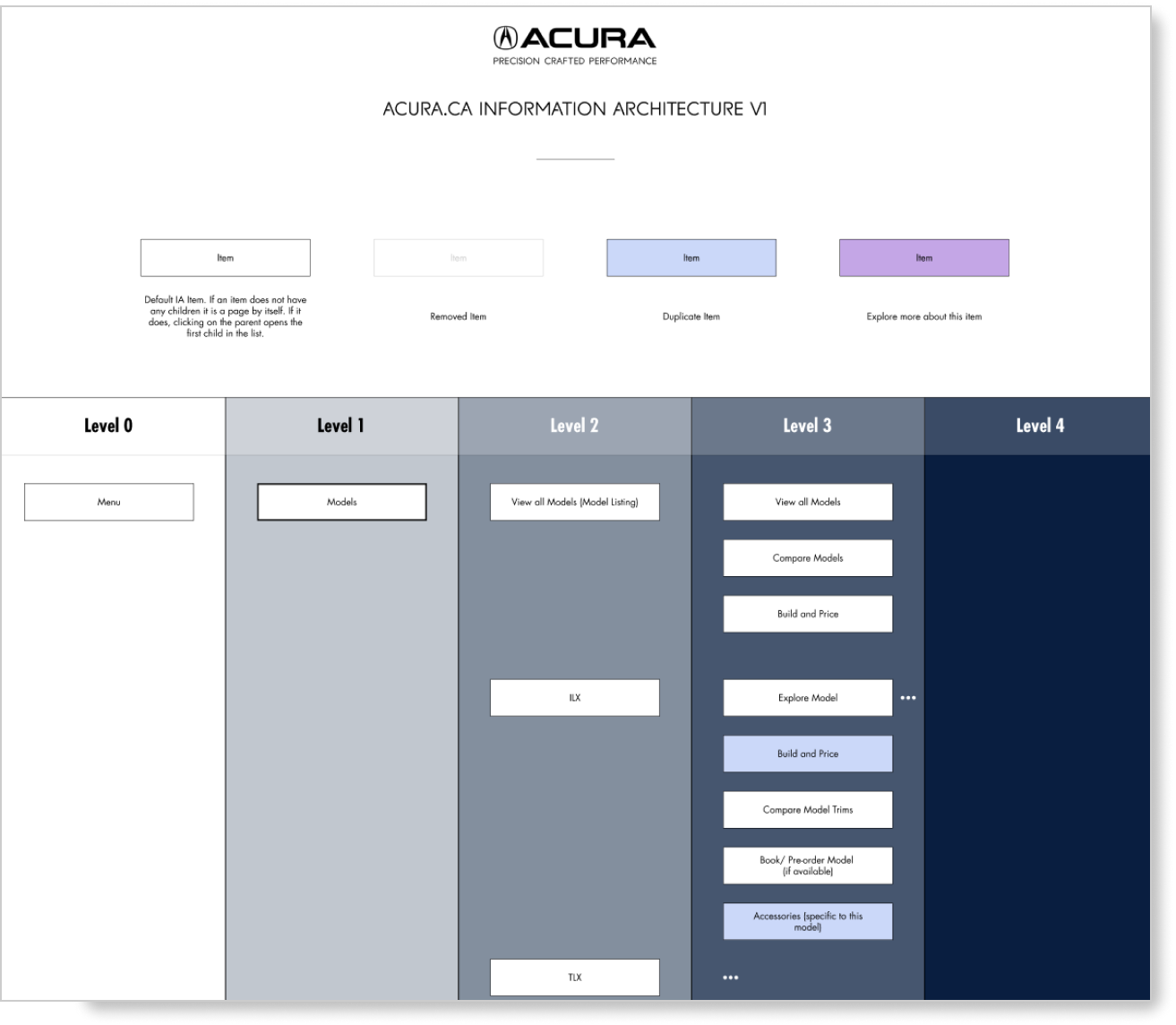
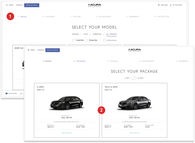
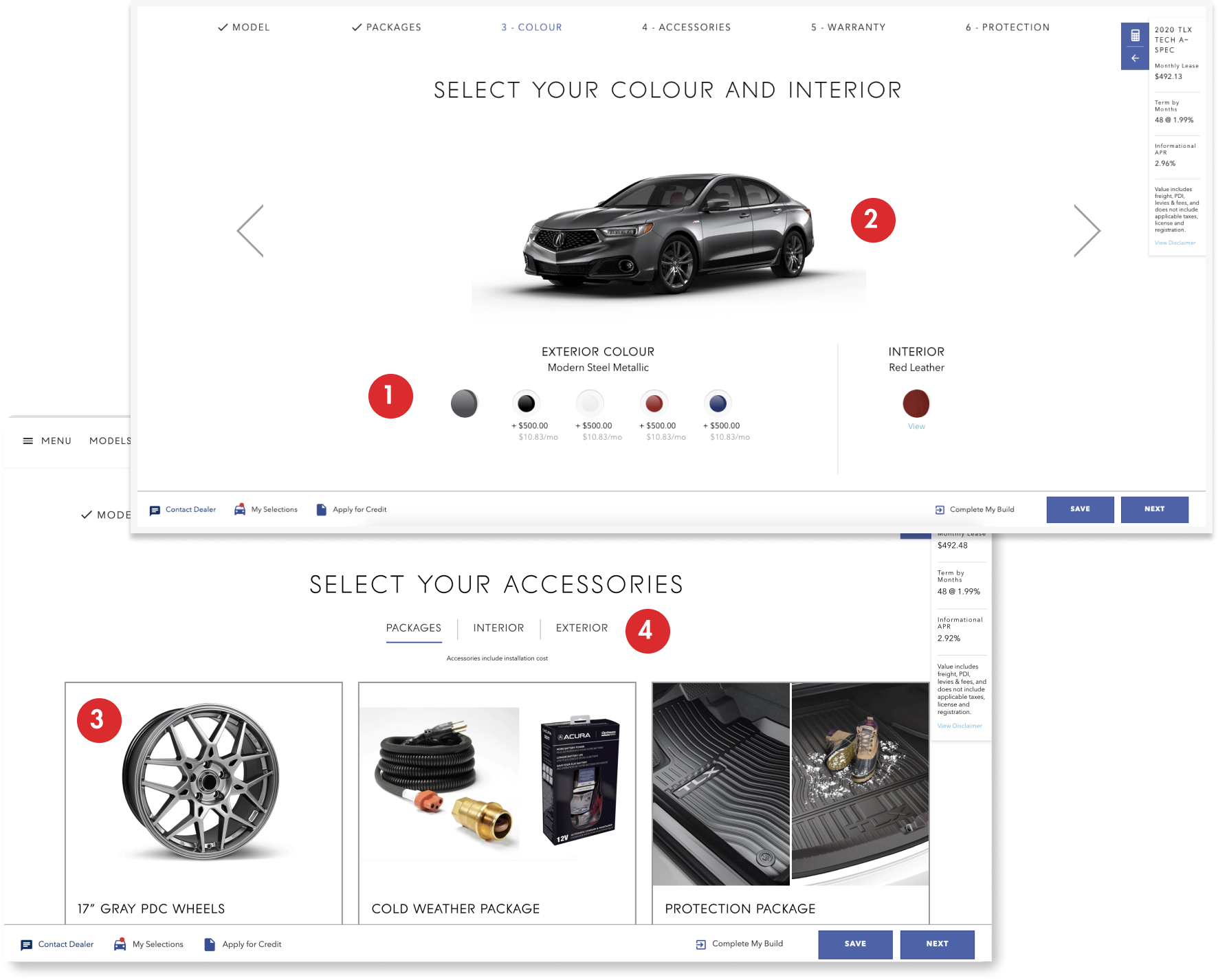
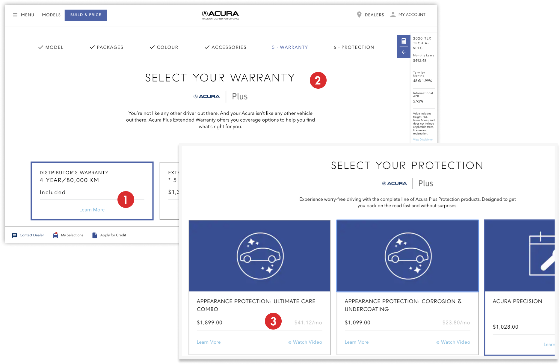
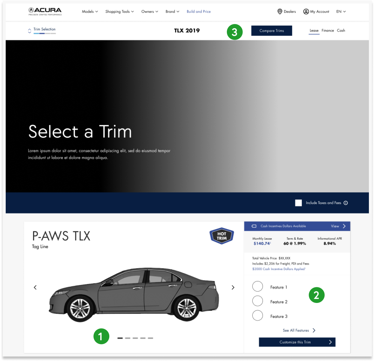
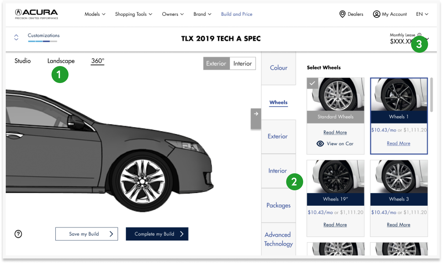
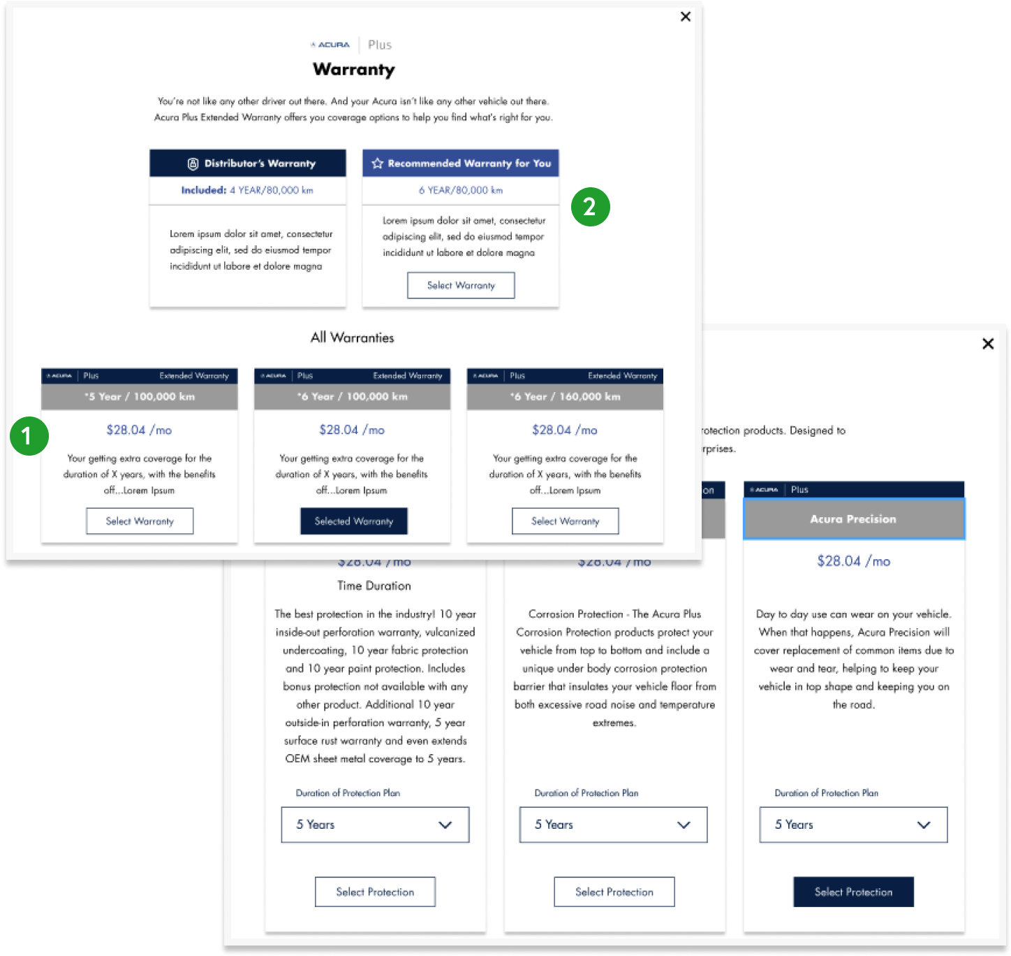
Acura engaged my UX team to redesign their current Acura.ca website. They are in the process of moving all of their web properties over to the CMS system, Sitecore. my team and I were tasked with redesigning the experience through the use of web apps and reusable components. We designed and prototyped customizable components for the business to reuse across their site. This redesign is part of Acura Canada's larger business strategy to able to sell their cars online in the next 3 years.
Design pod led. I lead one of three design pods tasked to redesign the website. My pod was responsible for creating UI components that would be used by all pods across the project before being handed off to the development team.
DURATION28 Weeks