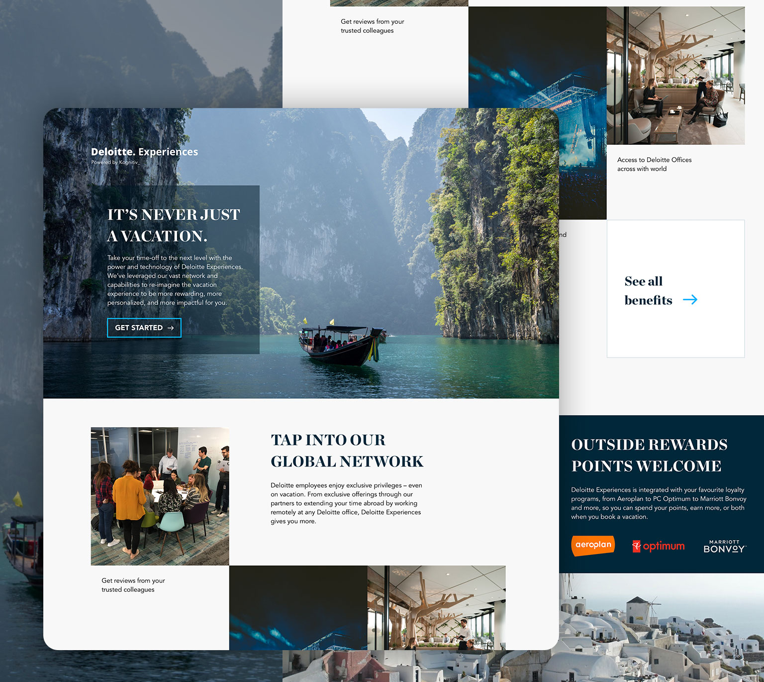
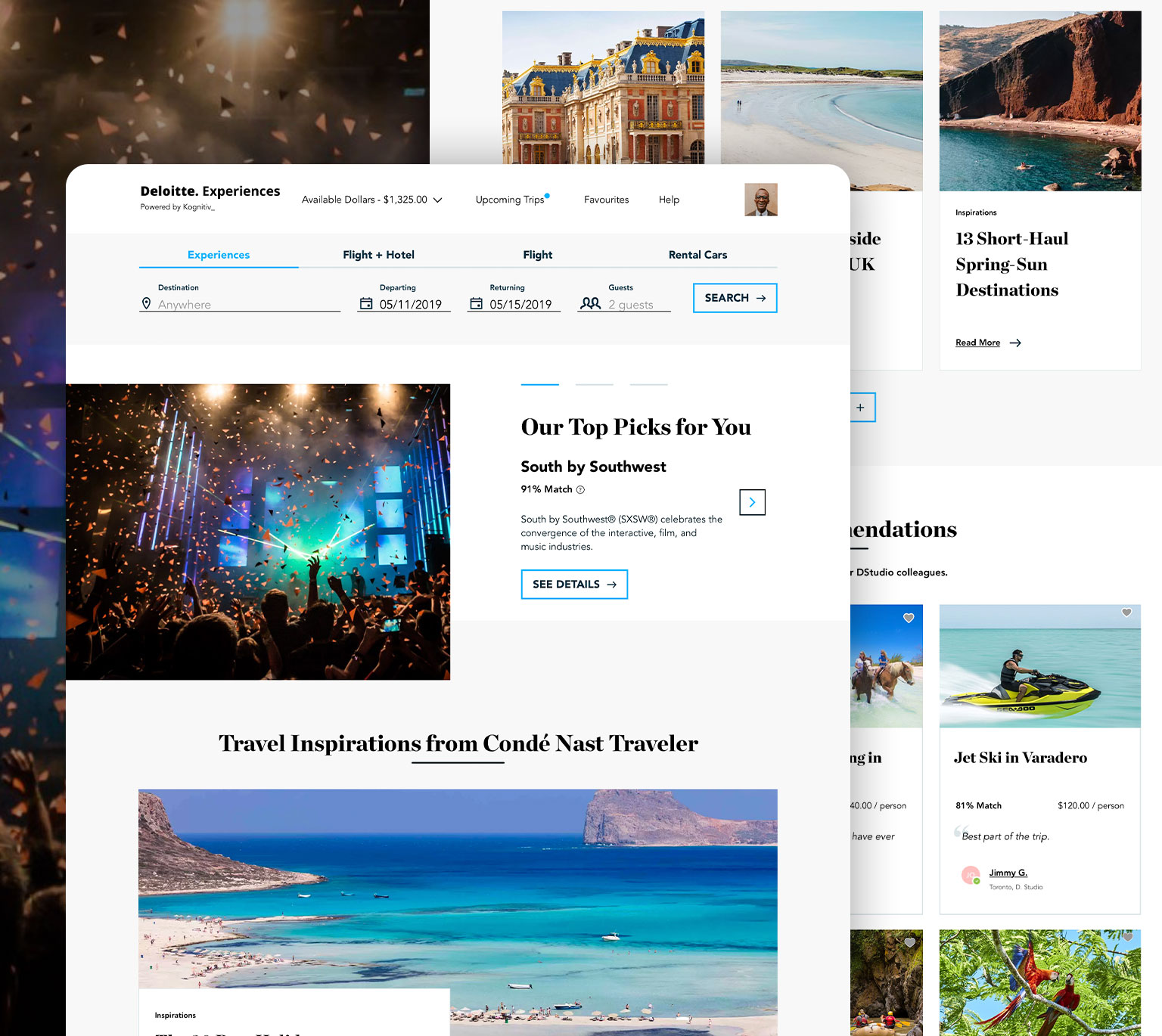
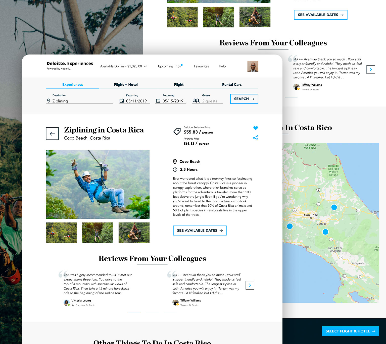
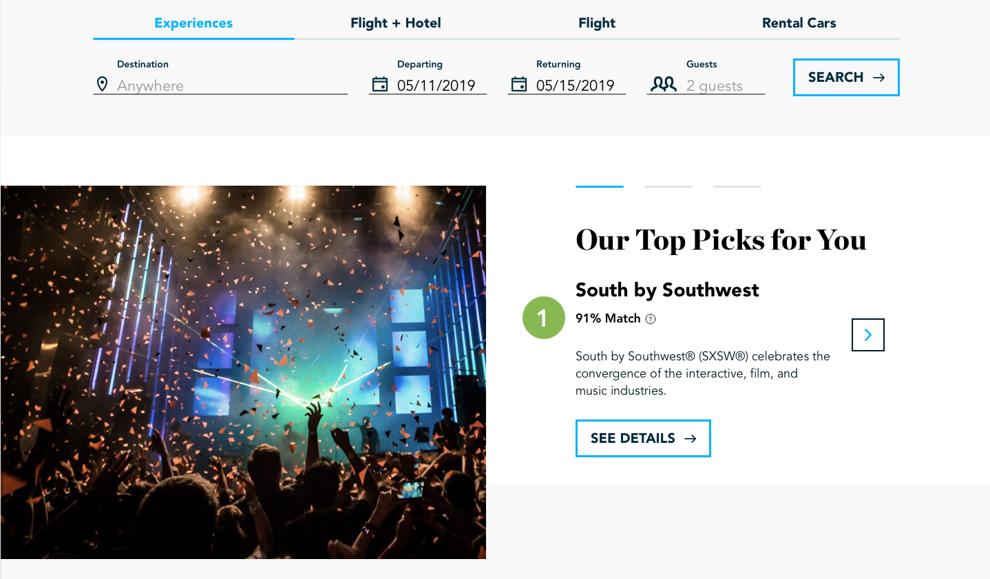
Product Design

Employee Travel
Platform

OVERVIEW

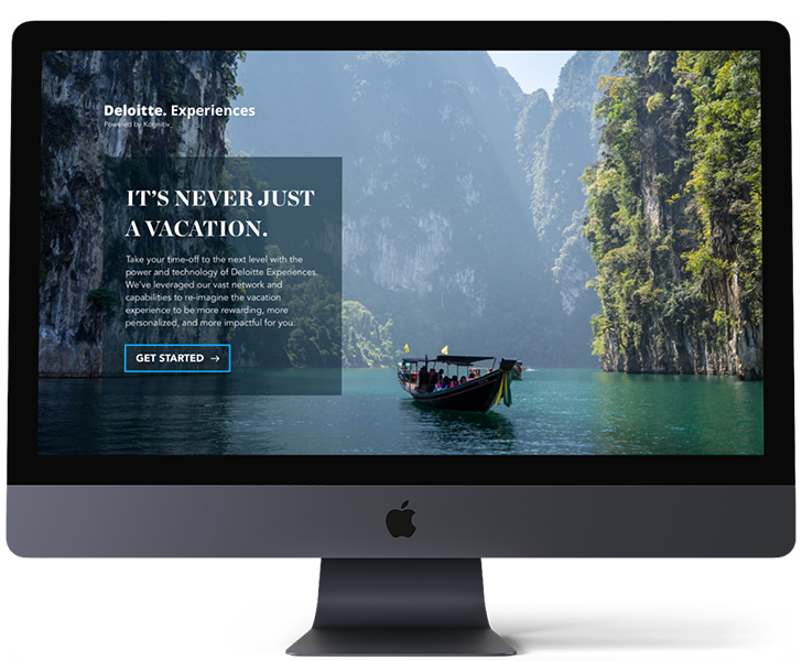
Enabling employees to take vacation.

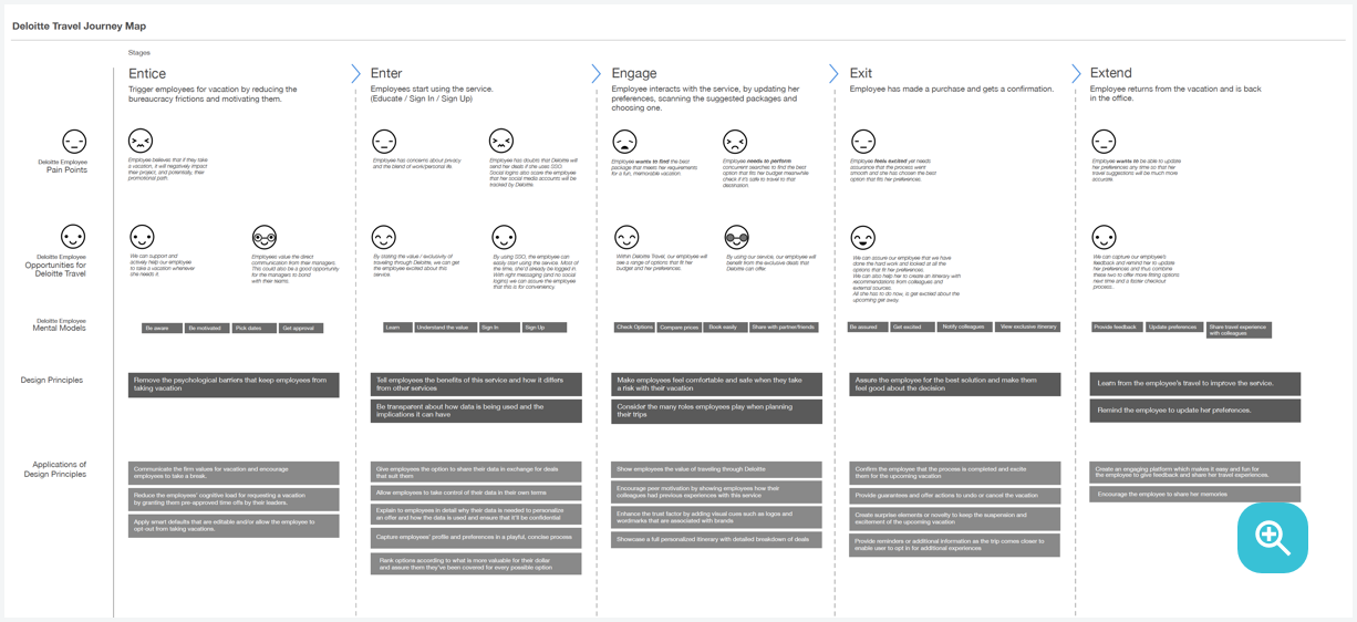
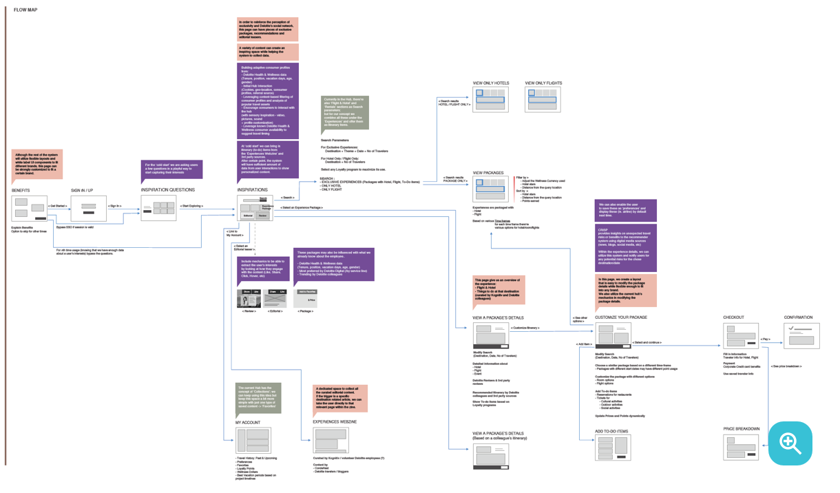
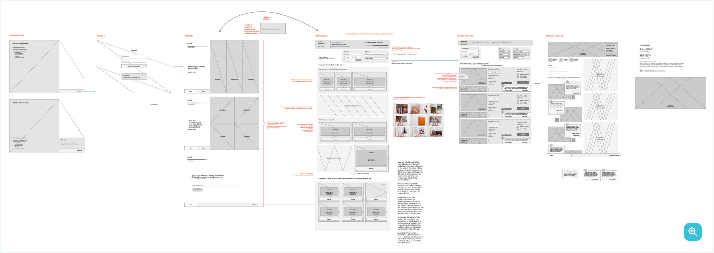
Deloitte was looking reimagine the wellness experience for its staff. Previous research had shown that the wellness benefits did not meet employee needs. Junior staff took about 4 days of vacation, while the senior employees took about 15 or more. This variance causes a problem for Deloitte on their balance sheet and unused vacation days become a liability for the company. In response, Deloitte collaborated with a travel partner to find ways to help employees take a vacation.

Role

Product Designer. Facilitated research workshops with the Doblin team, led user testing, worked with the engineering team to understand technical constraints and was the solo designer responsible for creating the look and feel on the platform.

DURATION

24 Weeks

CHALLENGE

How might we build employees a personalized wellness experience that enables them to take a vacation while aligning with Deloitte’s yearly financial goals?

Outcome

A new platform to help over 5,000 employees take their vacation and an increase in personal time off by 37%.

Deloitte is constructing a brand new digital platform where employees can use their benefits towards travel and vacations. I worked with the team to construct a MVP platform that allowed employees to use their benefits towards travel and vacations in a personalized fashion.

Product Preview

Design Process

Understanding the problem space.

My team and I started off by conducting generative and co-design sessions with Deloitte employees to understand their experiences taking and planning vacations.

We learned about how different types of travellers plan vacations, and we introduced them to the concept of “travelization” within the workplace. Based on our findings from earlier sessions about employee travel behaviour we found 3 main insights:

First Insight

"I don't feel free to take vacation."

Deloitte employees experience stress about asking for permission to take a vacation, due to the fear of disappointing team members, the pressure to be “always on, always available,” and/or self-imposed guilt.

Second Insight

“I need to feel assured they won’t mess it up.”

Employees expressed the need to get the most out of their vacation days and shared that the decision to use them is not made lightly. Employees want to feel like they have done everything possible to ensure a high-quality trip. As a result they book vacations using websites that have a positive brand reputation, trustworthy reviews, and offer guaranteed satisfaction.

Third Insight

"Deloitte is my ticket to exclusivity."

Employees spoke highly about Deloitte’s presence, vast reach, and global connections - an enticing proposition that they would like to leverage to elevate their travel experience.

Finally, we sought to test value propositions with people. I orchestrated an evaluative session where we tested three distinct value propositions with employees to understand their levels of comfort with seeking travel experience from the employer’s brand.

Personas

Figuring out our users.

From our research workshops, my team and I identified 4 types of users to focus on.

  • Patricia

  • The Perfect Planner


Patricia enjoys planning her vacation almost as much as she loves taking it. She starts planning months ahead of time to make sure she makes the most of the few free weeks she has each year.

  • Dan

  • The Deal Maker


Dan loves the thrill of the deal, and he knows how to plan ahead to maximize his fun, on a budget. His travel goal is to see as much – and spend as little- as possible.

  • John

  • The Last-Minute Jet Setter

John lives his life to the limit. He’s busy from sunrise to sunset and he doesn’t have time to fuss with searching though multiple websites to find the right vacation package.

  • Gail

  • The Goes with the Flow

Gail doesn’t need her vacation to be fancy, just different. She doesn’t believe that you can get to know a culture by staying in high-end hotels or eating at five-star restaurants.

Journey Mapping

Defining the problem.

Once we had conducted both workshops, I created a journey map based on our findings.

The journey map has five stages:

  1. Entice: Initiate employee vacations by reducing the bureaucracy frictions and motivating them.

  2. Enter: Employee begins using the service.

  3. Engage: Employee interacts with the service by updating their preferences, surveying the suggested packages and choosing one.

  4. Exit: Employee has made a purchase and gets a confirmation.

  5. Extend: Employee returns from vacation and is back in the office.

I then created a list of artifacts that might be needed for each stage.

Constraints

Gathering user data without asking for it.

Since the platform will offer personalized travel suggestions, I constantly collaborated with Deloitte’s data and AI team to understand the type of data we currently had on each employee and the type of additional data that will be needed for the AI engine to generate personalized suggestions. The challenge here was how to gather the data without directly asking for it?

My team and I solved this problem by looking at the current UX flow and finding points of interaction where we can add elements that'll feed into the AI engine. For example, if a user likes numerous beach vacation packages, it tells us they might be more interested in beach vacations.

The data team also developed a way to read the users cursor data and seeing how long the cursor was left on a certain section, the movement of the cursor, etc. to build a more accurate AI engine.

I refined the UX flow to account for these interaction points.

Wireframes

Research to design.

Once the research was completed, I created wires and began testing them.

We I started creating the wiresframes, I saw that we had enough information on the users that they won't need to search for a vacation package. Instead the AI engine would be able to provide personalized vacation packages. I decided to test out two variations. The first version without needing to search for recommended packages and the second with the ability to search for packages. The second design was built similar to the current platforms like Expedia.

From the testing I found that users initially liked the version that provided recommended packages without the need to search for one but were immediately taken back when they couldn't search. This also went against one of our insights where users wanted a sense of control. We picked the second version to build out high-fidelity designs for,

Visual design.

High-fidelity.

Once all the wireframes were tested and completed, I started to create visual mood boards for the artistic direction.

Mood board 1 - "Wallpaper Guide" - Figurative, Nostalgic, Pastel

Traveling like in 50s, 60s when it was a privilege, exclusive and people dressed nicely and had handcrafted luggages and bags.

Mood board 2 - "Swiss Style" - Business and Exclusive (Functional and Beautiful)

Functional and beautiful - Bold shapes, typography and colours. Typography is a crucial part of the design.

Mood Board 3 - "Current times" - Modern day UI, seen commonly in the market

Less risky but also harder to stand out. Iconography with line arts, fields with gradients.

However, when I presented the mood boards, I got push back from the Deloitte internal team that it had to be branded for Deloitte and feel like it belongs to the Deloitte ecosystem. They allowed us to change certain things like the grid system and the secondary font but we had to follow the rest of the Deloitte brand guide. I decided to use the Deloitte Digital brand over the standard Deloitte brand kit. This is because the Deloitte Digital brand kit contains the Chronicle Display font. We wanted to ensure the platform had an exclusive and luxury feel to it

Testing

Making sure we got it right.

Once I designed all the screens, I created an invision prototype for usability testing. During testing, I found that certain pages needed to highlight the copy for the CTAs and that the search process needed refinement.

Underneath the search there is a section called “Our Top Pick for You”. This section highlights top packages for the user based on answers we received from the on-boarding questions and the various data points that are being fed into the AI engine. When I originally designed the section, there was no percentage match listed. Users were confused as to how this package was being recommended and felt a bit creeped out by it.

To eliminate this problem, I added a percentage match to show that “Our Top Pick for You” is being recommended through the user input and the user data being fed into the AI engine. This helped remove the confusion.

Key Learnings.

When we initially began this project, our objective was to re-envision how people book travel. We took a blue skies approach to the project and decided to re-envision travel from start to end. To migrate this challenge we conducted several iterative debriefing sessions to make sure we were in-tune with the requirements.

Our greatest learning as a team was that we lacked an understanding of the travel partner’s current platform. To alleviate this problem conducted competitive analysis to better understand the problem space and challenges.

Recent Works